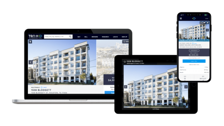
A better photo browser
Increasing user engagement and fixing image quality issues
Background
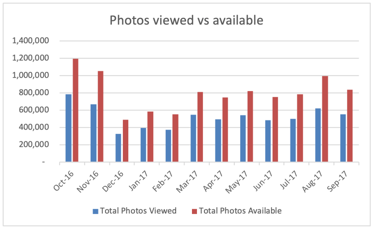
Ten-X uses marketing campaigns to drive potential buyers to online property listings. Analytics showed that visitors would often view multiple photos during a session.
Problem
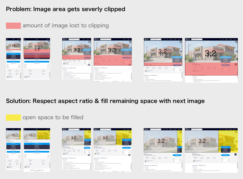
Engagement on the page was good but not great, and VOC surveys showed a number of concerns about low resolution images. On the sell side, brokers setting up their listing disliked the current layout because of inconsistent image cropping that was leaving out portions of their photos.
Target Outcome
Improve the viewing experience such that potential buyers engage more
- Increase # of photos viewed
Discovery Process
Collaborated with UX research to recruit and interview real estate professionals.
- Diversity of photos is important
- Buyers like aerials for the sense of location
- Buyers wanted to see photos of back-end aspects of buildings
- Brokers rated photos more important than buyers

Analyzed user activity data using Hotjar and Omniture resources.
Takeaway: use caution when redesigning familiar control
Met with stakeholders from operational teams that touch a photo on its journey to a customer: photography, on-boarding, and marketing. This exercise uncovered a number of internal pain points and antiquated steps that were ripe for improvement.
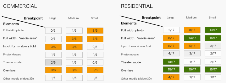
Analyzed photo galleries used in real estate contexts, and coded findings to summarize prevalence of UI strategies. One key finding was that few sites display the full-width photo on extra-large screens. This data helped me push back on executives that were campaigning for such a layout.
Design Process
Led Crazy 8’s sketching exercise. Resulted in a number of new and interesting ideas to explore.
How might we improve user engagement with the photo gallery?
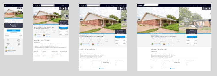
Mocked up multiple options for design critique
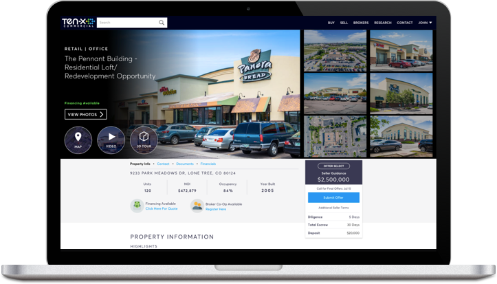
Text overlay brings more content above the fold.
Grid offers quick overview.
Split screen serves visitors interested in photos and data alike. Raises conversion CTA above fold
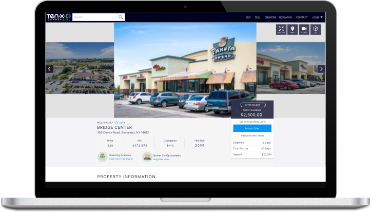
Carousel style
Defined responsive layout strategy for all screen sizes. We implemented a dynamic sizing rule where the height of the media area would depend on the breakpoint. Our new layout guaranteed that the lead image would not experience cropping, and gracefully degraded to all screen sizes.
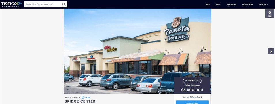
Before:
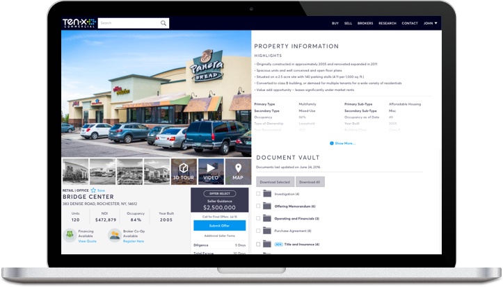
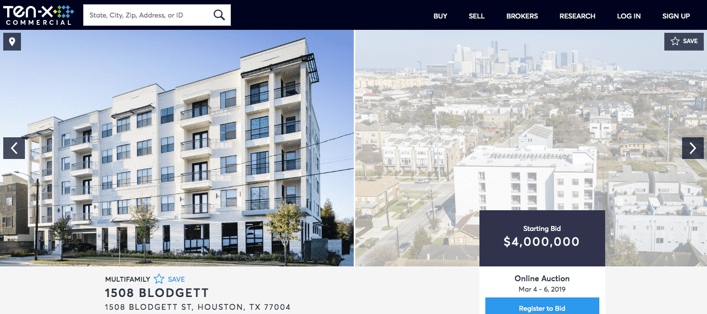
After:
Solution
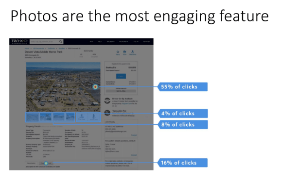
- More screen real estate devoted photos is justified by them being the most popular page feature
- ‘Next photo’ overlay provides a prominent affordance of more photos to browse
- Critical calls to action remain above the fold, such as auction registration and bidding
- Dynamic sizing eliminates photo cropping problem
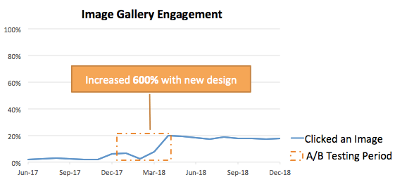
Results
A/B testing showed 6x increase in engagement
 Shaun Bhargav